

Evaluation Measurement Result Graph
Evaluation Measurement Result Graph
By viewing the evaluation measurement result graph, you can confirm the profile measurement went well and preciseness of the monitor calibration.
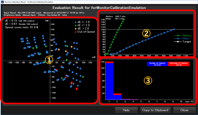
①a*b* color chart
The evaluation measurement result was shown on a*b* color chart. Evaluated colors are plotted on the graph colored by the amount of error.
less than 1.0 : Blue. Very good color reproduction.
Between 1.0 and 2.0 : Green. Good enough color reproduction
Above 2.0 : Orange. The error might not be accepted.
Outside Gamut : This color is out of the monitor's gamut and unable to reproduce on this monitor.
Adding to each color plot, there are average color difference values and gamut covering ratio on the upper-left of the graph.
②Tone Scale Graph
Tone scale graph shows the behavior of tone scale before and after calibration. Green is before, blue is after and white is the target tone scale.
If the blue curve and white curve are overlapped, we can interpret the calibration has good preciseness.
③Color Difference Histogram
This graph shows histogram of color difference of the evaluation measurement. Blue means wihin the gamut, Red means outside of the gamut, so we can recognize the quality in one glance. Good calibration shows the distribution less than 1.0 or 2.0, very few portion of red.